|
Ariana Pientka
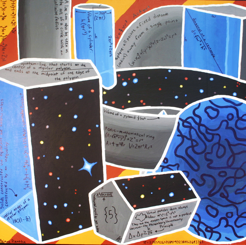
My acrylic painting went through many drafts before it settled into its final form. I didn't choose an artist for inspiration, simply because I felt it would be easier to make something without being constrained to a particular style. I already knew from the beginning that I wanted a star field in my painting, but I wasn’t quite sure how to integrate it. At first, I put just a couple of shapes floating in space. It didn’t get approved, so I went back to the drawing board and added a few more oddball shapes. It still wasn’t approved, so I went back and edited a few of the shapes to have some opaque sides. I then had the idea of cropping the star field so that instead of having the shapes float in space, the shape faces would be windows into space. I love the combination of the clear windows showing that the shapes were hollow and finite, and those same shapes having faces that showed the deep infinity of space. However, it still looked incomplete, so I added the stripes in the background to contrast the colors and tones used in the foreground. Adding the math was fairly easy, since I used a variety of different solids. We had to put as much unique math on our paintings as possible – things present in our painting that weren’t on others’, to prevent the math on our paintings from all being the same thing. The star field allowed me to put in the chemical equations for nuclear fusion, which goes on in the center of all stars and creates all elements on the periodic table up to iron. I also got to put in some particle physics, specifically virtual particles and how their existence prevents space from ever being a perfect vacuum. It was a lot of work, but I’m very pleased with my final painting. |
|
Amanda Trieu
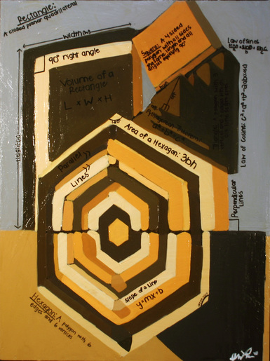
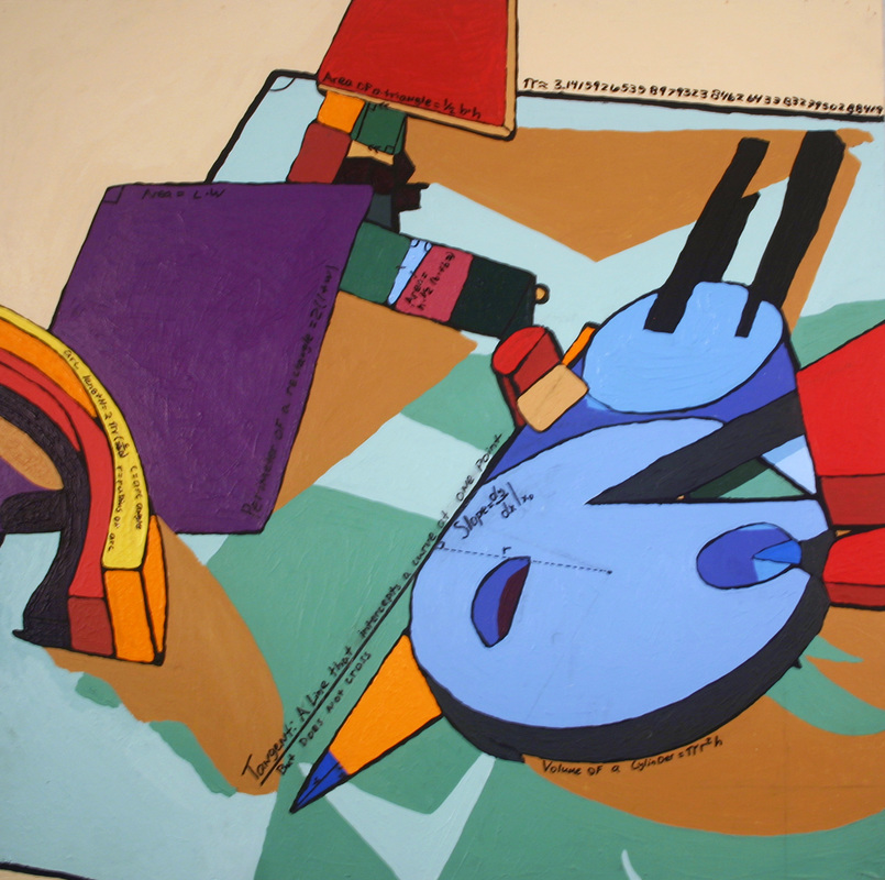
My acrylic painting was first made on Google SketchUp and then put on canvas. I then projected it and then traced it onto my canvas. It was inspired by American painter and printmaker Frank Stella. The pieces by Stella that inspired me were “Sunset Beach” and “Sunapee”, which are both considered minimalist pieces. The original colors I used for my acrylic painting were bright, girly colors such as pink and turquoise, but were once again changed into warmer tones such as Mustard Yellow and brown. It took me a little over two and half weeks to paint it and a little over a week to brainstorm what kind of math I chose to incorporate. The math I used for my acrylic painting were basic principals such as Areas, Angles, Volumes and Slopes. To top it off, I also added definitions of the shapes I used. In the end I was very proud of my work; it was a difficult piece to do, but an overall good experience. |
|
Ana Vargas
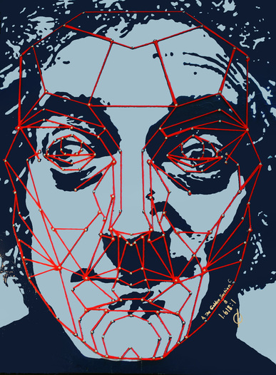
The Marquardt Decagon Mask is a facial map based on a relationship between the Phi number (1.618…) and the Golden Ratio. It’s used to determine mathematical human attractiveness based on the placement and proportion of facial characteristics. Initially, the mask was the sole point of my acrylic painting design, with a variety of decagons and triangles composing the background. However after a meeting with Jeff and some edits, the direct application of the mask to a human face seemed to be a better exercise of the mathematical concept itself. After finding a nice portrait of a profoundly handsome actor named Marty Feldman, I used it as the face I would paint and apply the Decagon Mask to. Painting proved to be more challenging than I expected. It was very important to outline and paint small spaces carefully because those fine details composed parts of Marty's face as a whole. I had to remain very aware of lines and borders to keep the face legible. It was also difficult to mix the same two shades of blue every single day. The math behind my painting can be a bit confusing because the concept as a whole is very broad. At first, this made it difficult for me to wrap my head around and completely understand the math. Essentially, the Golden Section is the foundation of the Decagon Mask. This mask is derived from a matrix which is created based on the ratio of Phi to 1. This ratio is known as the Golden Ratio and is based on and related to the Golden Section Line whose sectioning is known as the Golden Section. The overall length of the Golden Section Line can be seen as (x) + (1), where the relationship and ratio between (x) and (1) is Phi to 1. The ratio also applies to the relationship between the Line’s overall length and the length of (x). The Golden Section Line can be sectioned and duplicated several times to create other Golden shapes which help comprise the matrix the Golden Decagon Mask is derived from. |
|
Anne Wilks
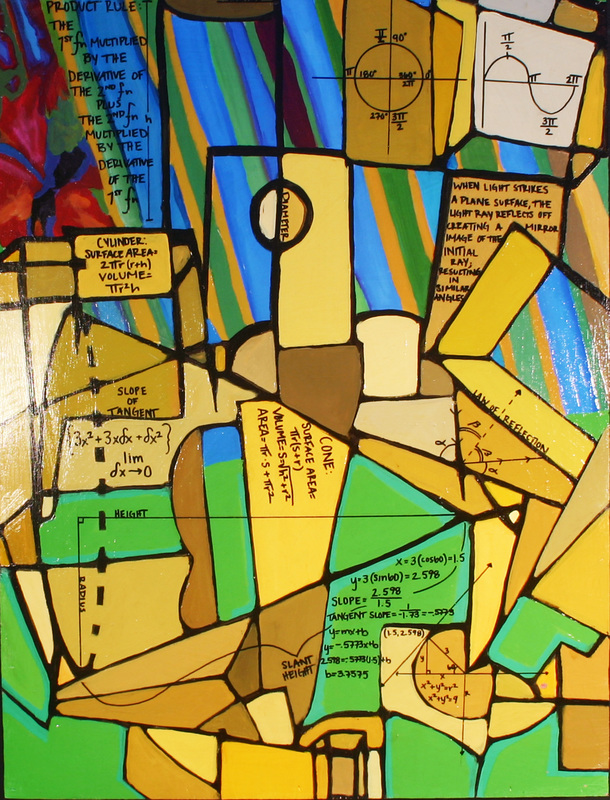
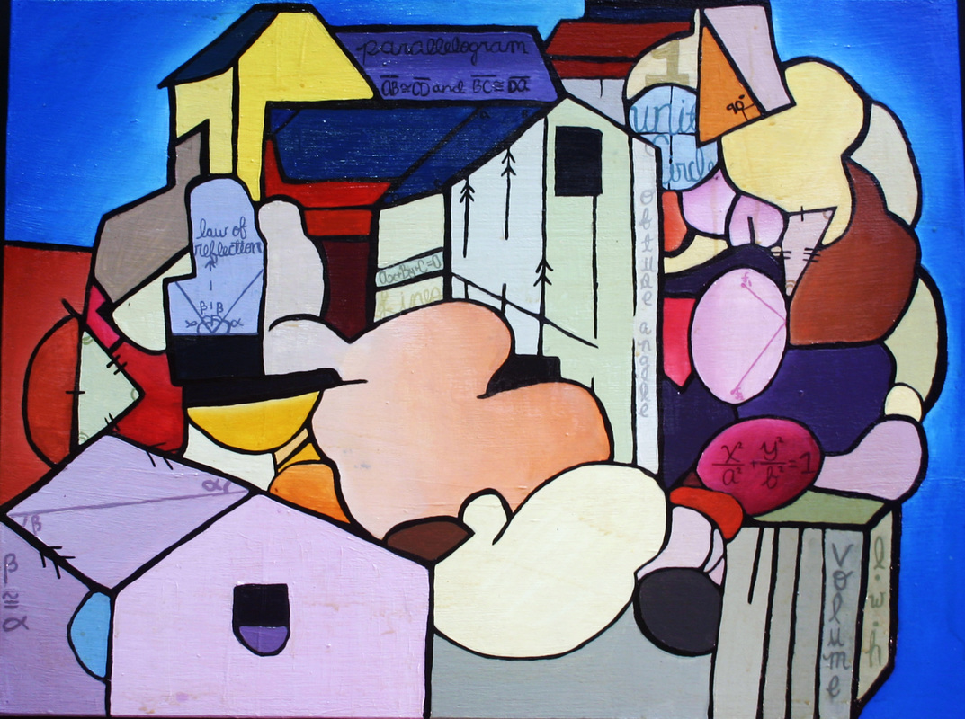
My acrylic painting was inspired by Georges Braque’s 1913 Pedestal Table. I wanted to incorporate aspects of his original painting but I also wanted to make it my own. To recreate Braque’s style I first traced the shapes from his painting onto tracing paper and scanned the image into the computer. ThroughPhotoshopI was able to make two dimensional shapes three dimensional; this allowed me to incorporate more math concepts and to make my painting my own. The background designs in my painting were pulled from other artists and were edited and combined with Braque’s piece to create my final design. The math concepts that I included in my painting are, the law of reflection, unit circle, sine wave,slope of a tangent line, the product rule, along with math for cones and cylinders. Examples of these concepts are shown and explained throughout my painting. I enjoyed the process of creating the composition and adding pieces to it to make it my own design of work. After I finished the actual painting I was skeptical about adding the math directly to the canvas but after I did, I thought that it added another unique dimension to my work. |
|
Anthony Wong
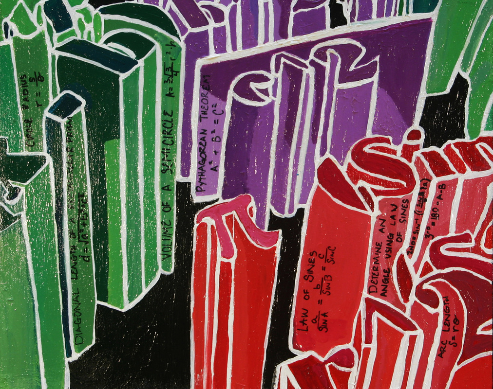
My acrylic painting is an overhead view of 3d text going down and looking like buildings. The 3d text I used was composed of mathematical equations. I got my idea from an Active T-shirt that I had recently bought. Jeff Robin gave me the original idea and helped me create a model in Sketchup. Using an overhead projector, I sketched a rough copy onto a blank board. While painting, I had a lot of trouble with white lines. When I made one mistake, I had to repaint the whole section. Eventually, with the help of Jeff, I was able to complete the painting. Overall, I am happy with my final product. I used Pythagorean Theorem (a^2 + b^2 = c^2), area of a cylinder (pi * r^2 * h), Law of Sines (sinA / a=sinB / b=sinC / c) and the equation of a parabola. If I could redo this piece, I would not choose a painting with so many straight lines. |
|
Beth Jacobs
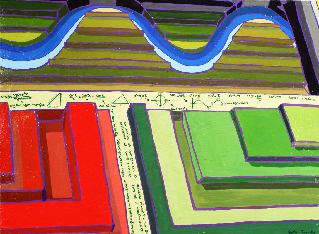
This Acrylic painting is inspired by Sol Lewitt. Majority of his art has to do with brightly colored shapes in large smooth curves. One of his paintings is a square cut in four pieces and in each piece is a quarter of a circle going a different direction, this brought up my idea for the partitioning of my canvas. In the bottom two sections I changed the circle to squares/rectangles and in the top I followed his curves by creating a perfect sine wave. This is what the math of my painting spurred from. Originally I was going to make all the lines black, however Jeff suggested that I make them a dark purple and thus I did so. I really enjoy how the purple looks bordering all the various colors. My favorite parts of this painting are the bottom two sections because the colors really make it look 3-D. I am not extremely thrilled with the colors surrounding the sine wave; however I am very satisfied with this painting. The math involved deals primarily with sine: trigonometric functions, law of sin, law of cos, unit circle, sin wave conversion, degrees to radians conversion, and derivative chain of sin and cos. There is also math involving rectangles such as area, volume and surface area. |
|
Andrew Love
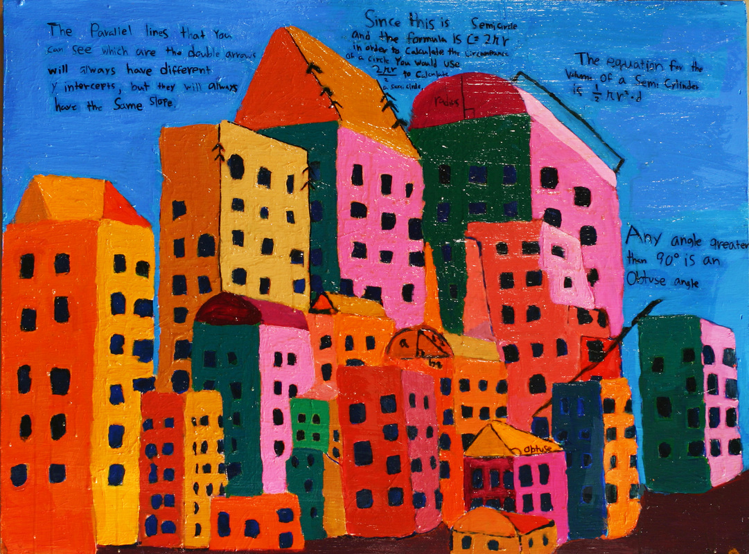
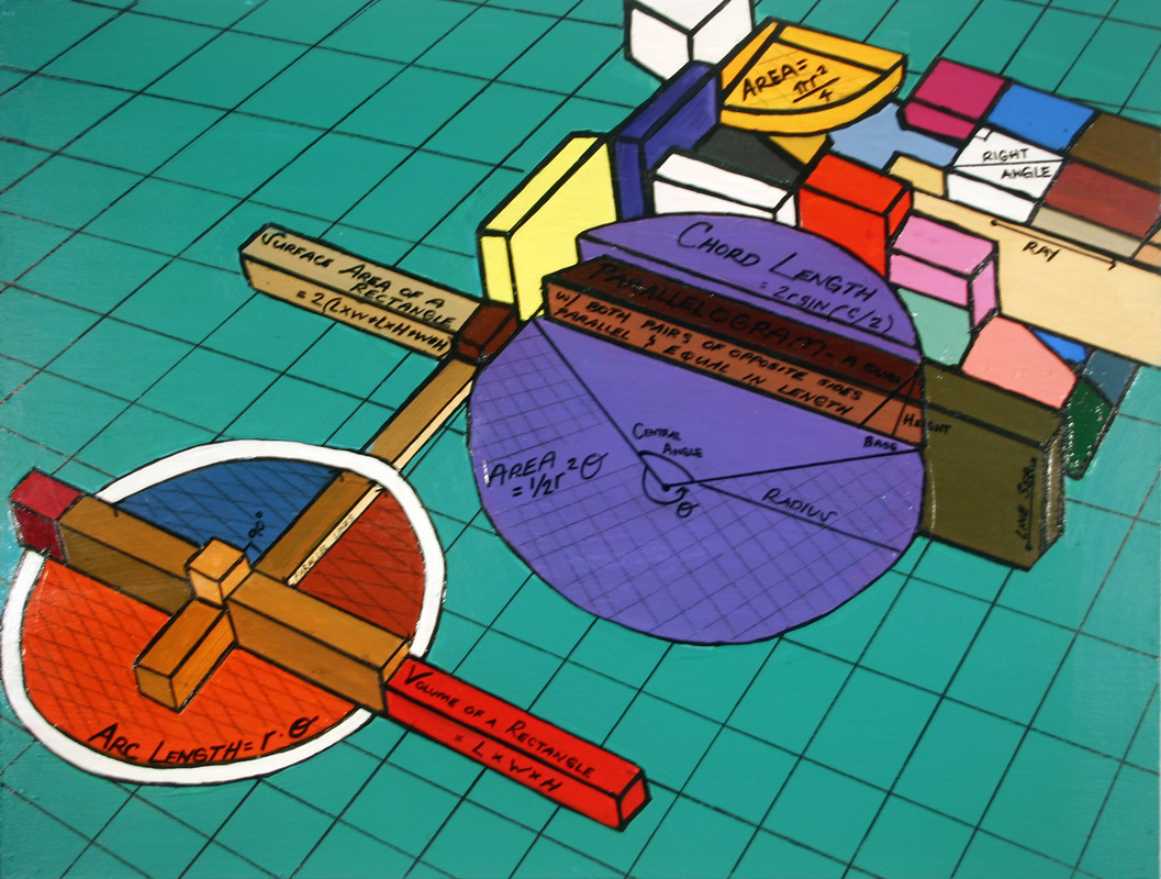
For the Calculicious project in Jeff Robins art Class, we were each assigned to research an artist and get inspired by their painting style and technique and incorporate it into our own math based art. My inspiration was based on research on Pablo Piccasso, Van Gogh, and with strong emphasis on Stuart Davis. Stuart Davis is an artist from the 1950’s who made art similar to Picasso but captured a more urban landscape with skyscrapers and a moody gotham feel. He was also known for painting each building a different shade. I reflected this technique in my art first by using the program Sketchup which allowed us to draw three dimensional designs. Next I chose colors that would best match the mood of our piece. I chose different shades of red, green, and brown. Then I transferred this plan onto a wooden canvas using a projector by tracing. I then painted the canvas using acrylic paint guided by the projected lines. After I finally completed the image from Sketchup, it was then time to incorporate the math and geometry that described the shapes on the painting. The equations were first written with a thin black paint brush. This did not turn out well, and I ended up using a sharpie to make the lines. The math that was used was the geometry of parallel lines, triangles, domes, and semi cylinders. I used parallel line geometry to describe the edges of the buildings aligned with other buildings. Trigonometry was used to describe triangular rooftops and the definitions of obtuse, acute, and right triangles defined by the degrees. The circumference of semi cylinders were found by the equation by C=2*pi*r/2. To find volume of the semi cylinder. C=½*pi*r^2*L. The painting took two and a half weeks to be completed. It was important not to rush because it required focus to make straight lines with the proper colors. Knowing that it was a slow process, I felt relieved knowing that time was not of the essence. This project is something I am very proud of because I feel that I put my best effort forward. |
|
Beverly Levene
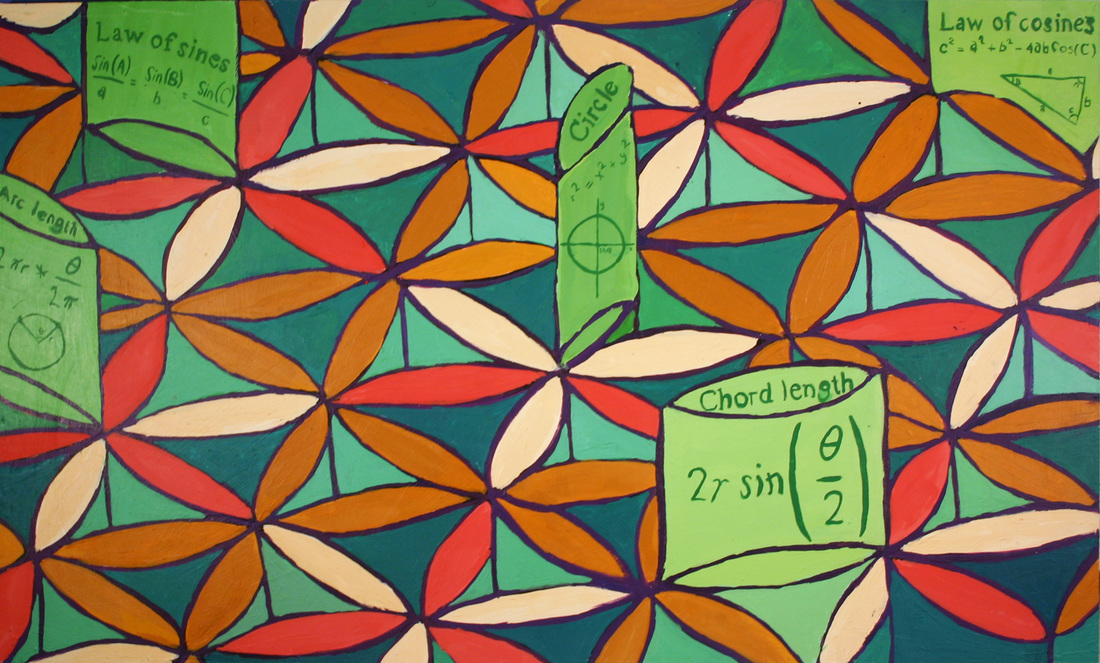
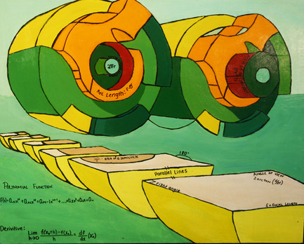
My acrylic was designed in Google sketch up. The basic pattern on it is the flower pattern that is created by six intersecting equal circles. Connecting the intersecting points of the circles six equal lateral triangles are created which together makes a equilateral hexagon. You can also find the edge length of the hexagon by using the cord length equation. That equation is can be found by using the law of cosines. Edge of one of the flower peddles can be found by using the arc length equation. |
|
Brad Jensen
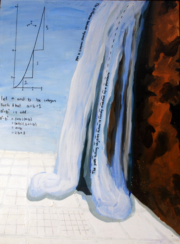
For my acrylic painting I wanted to do something very different. I wanted it to be abstract without being geometric. Before I began, I thought of the math I wanted to put on the painting, and then tried to imagine a way to represent it. After some time, I came up with the waterfall and a plane. I combined an image of Havasu Falls with a picture of a cliff face and applied several filters in Photoshop to produce the image I based my painting on. Unfortunately, the math was not approved, and so I changed it to the math regarding parabolas and squared numbers that currently resides on my painting. The waterfall and cliff face were the most difficult part of the painting and required many attempts before I produced something of acceptable quality. I struggled with gradients and shading the most. It was not uncommon to spend several periods working on one section of the painting, only to paint over it the next day. After I received some help from Jeff Robin, both were brought to their current state. I thought that painting with acrylic paint would be significantly easier than watercolor, and I had somehow convinced myself that it would just come naturally. By the time I completed my painting, I had learned the error of my ways. |
|
Carl Yoryshs
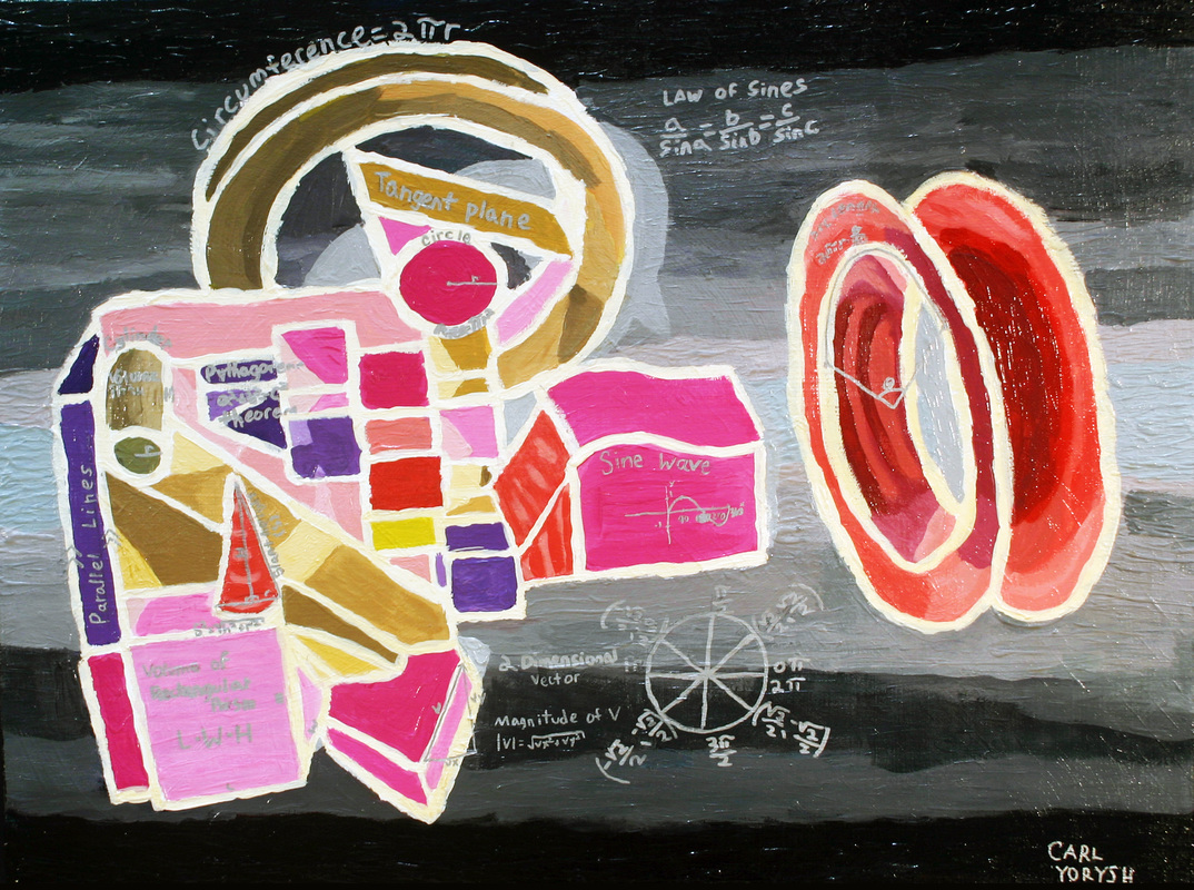
I chose to do a painting inspired slightly by Kandinsky. I chose to add a checkerboard on mine because of Kandinsky. My painting is also a Google Sketch-up creation. After making my basic Sketch-up I colored it mostly greens and other cool colors, and then I decided to use Photoshop to invert all the colors so it became mostly pink. Another feature of my painting is its extremely thick lines and textures. It gives the painting a good appeal and I think it turned out quite well. Another thing I planned on having from the start was a tangent plane. I made sure to have it in there and make sure to make it very clear what it was. |
|
CJ Joseph
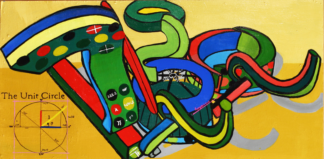
When painting my main focus was on color mixing and it took a lot of time when first mixing colors, but as the painting progressed, I started to improve. I remember asking Jeff if it was done a bunch of times, and he kept me at it, until we both could agree that it was finished. The reason why was because it had to correctly match the Sketch Up design. I thought of the math behind my painting, before I started to paint. My main math focus was circles. The area of circle (π*r^2), a visual of diameter and radius within a circle, angles of lines, and the unit circle were included in my painting. Minor and major axis were also labeled; these are found in the ellipses. The unit circle shows where the tangent lines are located and includes degrees and tangent line points. This unit circle has importance, because of the blue carousel looking object in the center. I noticed that the bars that hold it up on top looked like the lines in the unit circle. I wanted to paint the unit circle on the blue carousel, but only added angles and a tangent line, with the unit circle more neatly displayed on the side. |
|
Connor Pohling
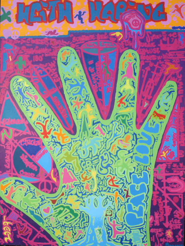
At the beginning of this assignment I was totally unsure about what artist or style I wanted to imitate. I spent a long time searching up artists and certain techniques, but none really stuck out to me. I was really not finding the inspiration, then I ran into a few works by Keith Haring. Haring caught my eye due to his basic shapes and bright vibrant colors. He is very well known for his cartoon like characters, along with an over feel of happiness and love. I decided to take this idea of peace and love and incorporate it with a hand; I choose a hand because I thought it was a very suitable symbol. I then had to incorporate math into the painting: instead of writing my math with pen like everyone else I decided to take a risk and make my math portion just as much of the art as the focal point, the hand. After this was complete I had a small space on the upper portion of the canvas. I took this unused space and incorporate my inspiration; I painted Keith Haring’s name. The color selection for the paint was just off of what I thought looked good in that situation. For the most part this painting was completed on the fly and changes were made when necessary. Overall I thought my painting turned out very well and I hope I can continue to explore my creativity using paint. |
|
Deandra Williams
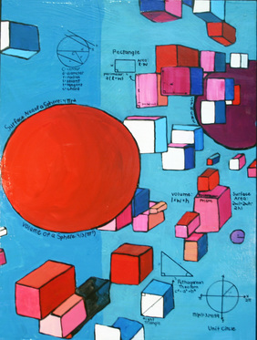
I never believed people when they said painting was a process until I started painting for myself. It was important for me to have a perfect painting, but I didn’t even know how to start. I played around with a lot of shapes, but I couldn’t get away from spheres and cubes. I really liked their 3d dimensions because it looked like they were coming out of the painting. I took advantage of this feature in my painting by creating the illusion that cubes were floating in mid air. I used colors that were bright and worked well with each other. I didn’t want the math I added to overshadow the whole painting, so I spaced it out evenly. However, I left the larger sphere free of math so that it would stand out. |
|
Deja Malone-Persha
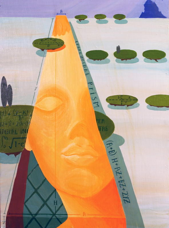
While searching through online archives I found a particular painting that struck me. Salvador Dali has always intrigued me, although I had never seen the painting, “The Apparition of the Visage of Aphrodite.” It was immediately pertinent to the design of our project curriculum. We were assigned to incorporate geometric shapes into our paintings to exhibit mathematical, specifically calculus, concepts. This painting features a large trapezoidal prism and numerous ellipses. I used a similar composition and made the painting emulate a landscape. I painted a portrait upon the trapezoidal prism that mimics the design of classical sculpture. The ellipses form the illusion of floating soil and landscaping at various heights and sizes. Once I had finished the foundation of my painting I applied the mathematical concepts in darker shades so they appeared as an overlay. My landscape runs of the edge of my canvas, illustrating a seamless surreal landscape. |
|
Donovan Boone
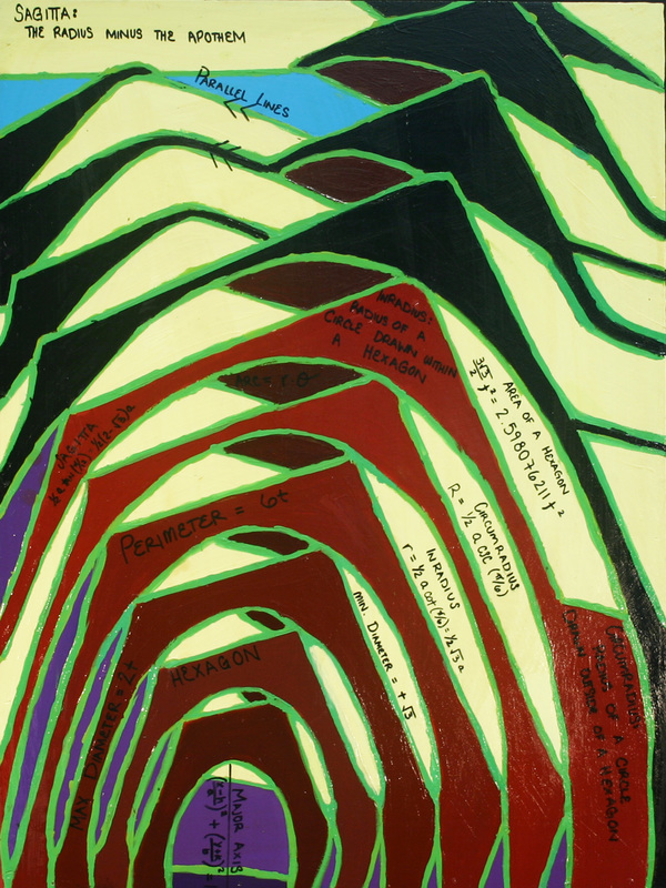
Contrary to my initial expectations, my painting took a tremendous amount of time to complete. The entire processes of my painting: its creation on sketchup, tracing on an overhead projector, painting with acrylic paints, and the mathematics were all subprojects of the main art piece. The math involved includes: the area of a hexagon, the explanation of the apothem and sagitta, and many more geometrical equations and formulas. Once I began painting, the most frustrating part was trying to mix the same colors each and everyday. But as time went on I learned new techniques and was able to make colors as close as possible to the one I had before it. Overall, I was extremely happy with my final product. |
|
Emily Burns
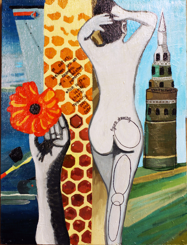
When I began my painting, I was unsure of what subject I wanted to paint, but I knew I wanted my painting to stylistically resemble a collage. As opposed to focusing on specific math concepts, I wanted to focus on applications of math. I looked for thins in nature, science, and various other fields that incorporated math. Though I enjoyed painting overall, some parts of my piece were definitely challenging. Parts of my piece were in grayscale, and other parts were both very realistic, and these proved to be a challenge because there were distinct parameters as to what I could paint and the technique I would use to paint it. Overall, I am pleased with my painting, but definitely think there is room for improvement. |
|
Gus Gonzalez
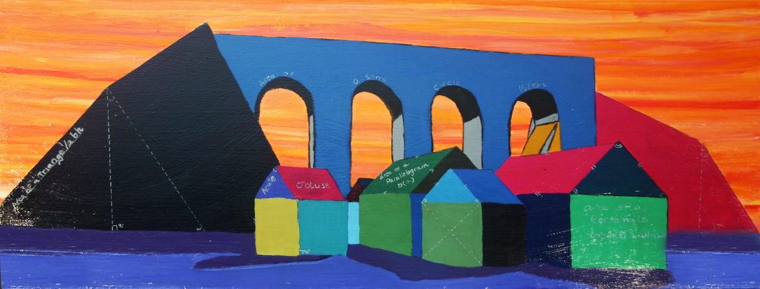
When this project was first assigned I had no clue as to which artist to research. After searching through artchive; an online art gallery, I found Georges Braque. His work instantly struck me as beautiful. Braque’ style was reflective of an interest in geometric shapes known as cubism. The reason I chose to model my painting after Georges Braque’s Viaduct at L'Estaque, is because I liked the way he was able to capture the architectural structure of the buildings in his town and reduce them down to geometric cubes. One of the most challenging parts of this project was using Viaduct at L'Estaque as an inspiration to create my own piece in sketch up. I really enjoyed painting my piece, although it was very hard for me to get every single color correct because a lot of them were so closely related.I found that mixing the colors for each part of my painting was the most challenging part of the project, however I really enjoyed going through this process, eventually creating a masterpiece. My favorite part of painting was the background. I enjoyed this part so much because of the vibrant streaks of orange, red, and yellow. The math that I incorporated into my painting was fairly simple. It was mostly geometric concepts such as; surface area, area, and angles specifically area and surface area of triangles, squares and rectangles. The most difficult math concept was the area of a semi circle, this equation was basically the same as the area of a circle but has a ½ in the beginning. I was really happy with the end product, I like the way all the colors worked put 'the colors complimented eachother within the composition'' with each other and although my piece was so similar to Braque’s it is still apparent that Viaduct at L'Estaque was the main inspiration for my piece. |
|
Jessica Brightman
My acrylic painting was inspired by Charles Demuth and his Trees and Barns: Bermudawatercolor painting. After working with watercolors I found this painting captivating, thus I wanted to recreate his art piece in a mathematical and acrylic form. First I created a Marquette based off of his painting and created my own composition for my canvas painting. I spent the most time during this process, coming up with a good final design to paint. With Demuth’s painting I traced over the prominent shapes with pencil, then scanned it into the computer and added colors to the different components of the picture. The colors and saturation needed to be perfect in order for me to be comfortable with moving on to paint the canvas. Painting was my favorite part of this project. Similar to the process I took for my water color, I enjoyed mixing colors and matching them to my Marquette. The most difficult part of this project was adding math to the painting. I was really happy with how my painting turned out without the math. Unfortunately the purpose of this project was to incorporate math into the painting. I did keep math in mind while creating my mock-up, but when reaching the end of painting I realized the things I originally intended to use for math were not one hundred percent perfect for my final product. This is where I probably needed to spend more thought before hand, in order to successfully create a project with both math and art. I really enjoyed the acrylic painting the most during this semester. Getting to paint something I created was interesting, and it gave me a chance to finish something I could be proud of. |
|
Jennika Ann Esoy
My Acrylic Painting was inspired by the prominent Russian Expressionist, Wassily Kandinsky and his famous oil painting "Gravitation". The minimalism and purity behind Kandinsky’s work were some of the artistic aspects I wanted to incorporate into my own painting. I admired his ability to use the simplest geometric shapes like squares and circles but still have a dynamic piece. His paintings are very conceptual and I have yet to come across another artist who has hefty amounts of math in their art pieces (whether or not it was intentional) like Kandinsky has. Multiple programs like Google SketchUp,Geometry SketchPad and Adobe Photoshop CS4helped me design a three dimensional computer draft of the painting I would soon coat onto a wooden canvas. I traced the projected image of my draft onto the canvas and spent nearly two weeks painting it to its "perfection". There were a handful of changes made to my painting, making it different from the computer draft I designed inSketchUp and the other art pieces in the class. Even though the color scheme illustrated in my art piece is unlike the colors I chose for my draft, I feel like the colors used in my painting compliment each other better than those I originally chose. The geometric shapes found in my painting made it effortless to incorporate different mathematical concepts in the piece. Everything from general math, geometry, algebra and calculus can be found on my painting. I wanted to incorporate both simple math and math that some might not be familiar with. I was hoping that anybody who would come across my painting would walk away learning something new – if not mathematically.. something new about the artist behind the painting. Despite numerous changes and a handful of paint-covered shirts, I am tremendously confident and proud with how my painting turned out. I’ve also learned that patience really is the key behind a lively painting. |
|
Jen Dredla
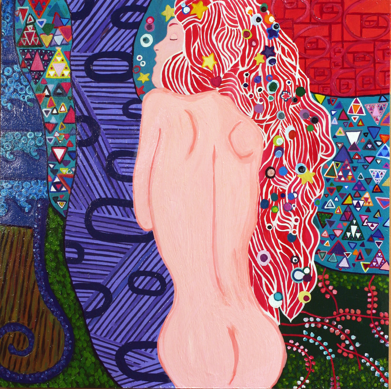
My painting was inspired by Gustav Klimt. I took multiple pieces of his work, slice n’ diced them, and then put them back together again. Gustav Kilmt often used geometric patterns in his paintings, so it was very easy to find inspiration. If you look closely at some of his art peices, the clothing worn by his characters are usually printed with geometric shapes. He also used matematical patterns in his "sea serpent" paitings- which were underwater. My painting features a naked woman (or sea serpent) lying across an abundance of mathematical designs. The two most prominent math concepts are the Fibonacci sequence and fractals. In the top left corner- the swirls are the fibonacci sequence. You can find this sequence in nature- especially a spiral sea shell. The fibonacci sequence starts out with 0 and 1. To continue the sequence, you add together the last two terms. So because 0+1= 1, the next step in the sequence is 1+1=2, then 1+2=3, 3+2=5, and so on. This sequence is represented by an increasing spiral of squares. Fractals is a harder mathematical term to explain. I hid a few fractal triangles within the pattern of other triangles. A fractal is a geometric shape that can be split into a reduced size part of the previous shape. It can continue inward or outward, and go on forever. The other patterns I used involve distorted ellipses and sets of parallel lines that are perpendicular to each other. The fascinating thing about this art piece is, at first glance, you miss the math so obviously displayed. But the closer you look, the more you slowly begin to recognize the geometric patterns and shapes. Can you see them? |
|
Jorge Corona
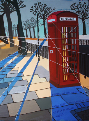
My acrylic painting is a phone booth in the middle of the streets of London. The colors revolve around the blue-gray color scheme and the phone booth is bright red. I did this on purpose because I wanted the booth to stand out. I’m not going to lie and say that this was a simple piece to paint because it certainly wasn’t. I tend to be somewhat of a perfectionist and I really took my time in making every streak of paint as precise as I could. After I finished the art portion of my painting, figuring out what math to add without ruining my piece was the true challenge. I chose go with vanishing points because they related perfectly to my piece. I figured out where the vanishing points of the shadow were and drilled a screw into it, then I outlined each point with twine and the overall piece turned out better than I though it would. I also made a dome outline on the top of the phone booth out of twine to show people that phone booths are actually spheres but with the sides cut off. I liked that I was able to incorporate math into a real art piece rather than just shapes because I felt like it was more of a challenge. Overall I am satisfied with the result of my final piece |
|
Kaleigh Rhoads
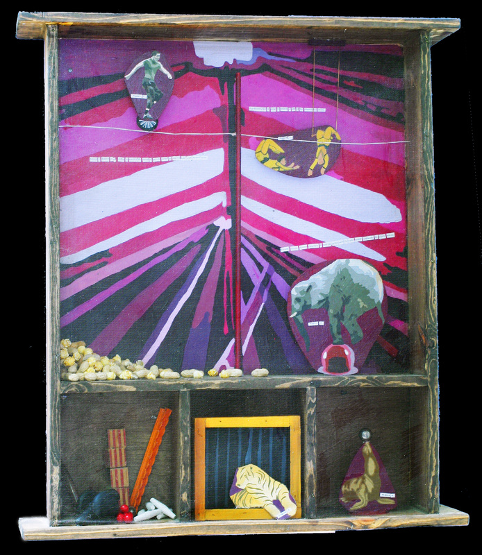
When I first saw the work of Joseph Cornell I was to say the least, inspired. While some of his work reminded me of displays or decorations one might find in a trendy boutique, others, such as his altars dedicated to people in his life were powerful and sentimental. The objects that he used in his boxes are all unique and are key to the worlds that he creates. I wanted my piece to be vintage, yet fun, and at the same time display math in "real life". After considering the different possibilities for worlds that I could create, I decided on a circus theme so that I could once again focus on balance and center of mass. I showed a variety of examples of where one might see balance on a visit to the circus, even in subtle ways. I took styles from several of Joseph Cornell's pieces to construct my own. Putting all the pieces together was the hardest part, especially since my box is larger than most of Joseph Cornell's and I didn't want any awkward empty spaces. It took awhile to finally decide that I was "done" with this piece but overall, it turned out better than I had ever expected |
|
Kristin Colley
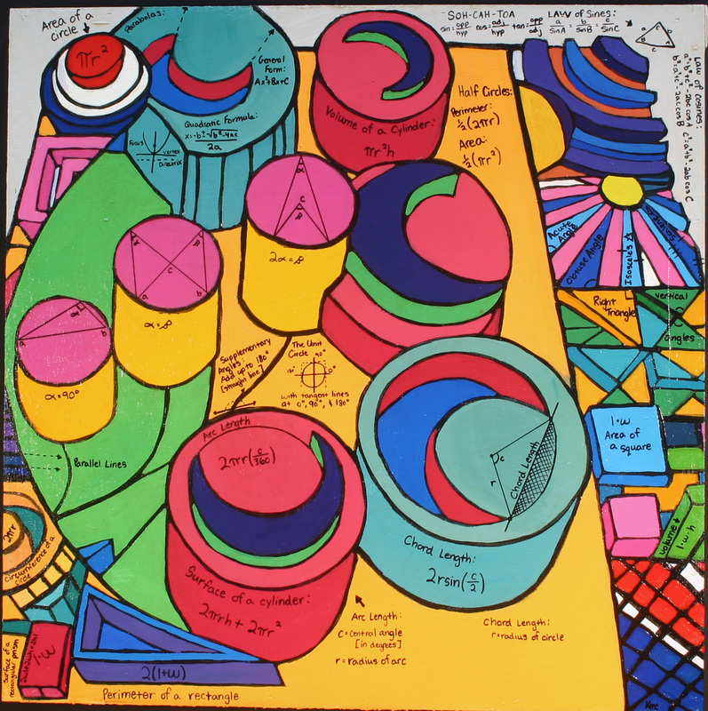
I based my acrylic painting off of an artist that I greatly admire: Alphonse Mucha. I saw his paintings in most of the hotel rooms I stayed at in Europe, and when I stumbled upon his work online, I knew that he was the person whose style I wanted to mimic. Mucha paints portraits of beautiful women, and his backgrounds are always filled with interesting shapes and designs. One thing that I really liked about his paintings are the half moons that some of his women sit in. I put lots of half moons in my painting, because they are my favorite part of all of his works. Along the sides of my own painting I made up different shapes and designs to paint, just like Mucha. Also, after looking into a specific piece of his, I saw a woman with a red beret in her hair. I have a string of circles on my painting, all connected with curved black lines, and they are based off the hair ornament I saw in the painting. I have more than enough math to cover the entirety of my canvas, not to say that I didn't struggle with it. My half moon shapes gave me the most difficulty. I wanted to do something complicated with them, but after weeks of trying out complex equations with Andrew, I decided to settle for something simpler. I focused on finding the arc lengths and chord lengths of circles. In addition to the previously mentioned math, I have written equations to get the area of squares, rectangles, circles, parallelograms, and cylinders. I have equations to find the volume of rectangles, squares, and cylinders. I have written trigonometric functions on my painting, such as SOH-CAH-TOA, law of sines, and law of cosines. All in all I like my art piece, and I don't think I would change anything about it. I like that my circles aren't perfect circles, because otherwise it would have looked too much like my original proof. I like my use of color as well. I enjoyed working on this painting a lot, and it's safe to say that I look forward to painting more in the future. |
|
Kristin Winfrey
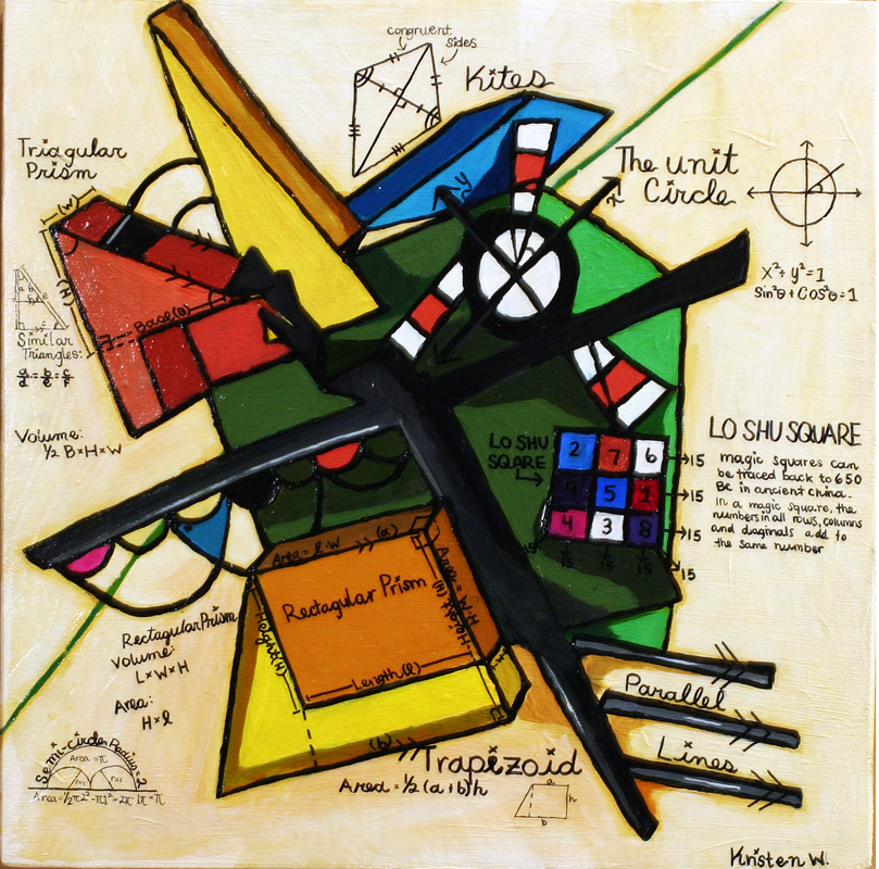
When I was given the assignment to make a painting that was based off another artists painting, I spent a long time researching different artists I could use. The thing that I had in mind was that I would have to be able to display math concepts and also have it visually appealing. When I finally found an artist of my choice I started focusing on different paintings they constructed. This was the difficult part; at this point I had made the decision to create different replicas on the computer. The artist i finally decided to use was Wassily Kandinsky. I gave myself 2 designs to base my painting on. Once I finished making the designs I spent the time talking with Dr. Gloag about the different math concepts in them. After finding the one that had the ideal amount of math on it I started the painting process. Painting my painting was both fun but stressful; adding layer after layer, and different variations of similar colors. After I’d thought that I was done I spent more time fixing certain areas and a few other colors. After I finish painting out my painting I added the math. The math used was a lot of things on triangles and different shapes. There was some math on the unit circle and different lines such as parallel lines. There was one interesting math concept that I included. It was the Lo-Shu square. The Lo-Shu square was unique because if you have a 3 by 3 box, they add to the same number in all directions. Overall I really like my painting and I don’t think I would change much on it. There were only minor things like touching up a few areas and there was one misspelled word. But I really like how the painting came out overall. Doing this painting really taught me different techniques I can use in the future and also made me become a better painter. |
|
Mariah Smith
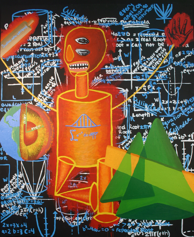
I knew from the moment we started this project I wanted to emulate the artist Basquiat in my painting. I found his work inspiring and his style relevant to the project at hand. In many Basquiat paintings he writes all over the background and in some paintings includes mathematical functions and geometric shapes sporadically throughout the piece. This aspect of his style was something I knew I wanted to include. When looking though a Basquiat art book I found a painting he did of a character with arms that made the shape of a parabola, so I decided to recreate this character into geometric shapes and include it in my painting as well. For the background of my painting I included information of parabolas and cylinders which I painted in white and then light blue. The next thing I did was paint the geometric character over the mathematical background. As time passed a rolling pin, earth and conic section where added into the mix. I think the painting turned out great and I am very proud of the work and creativity that went into it. |
|
Nick Agler
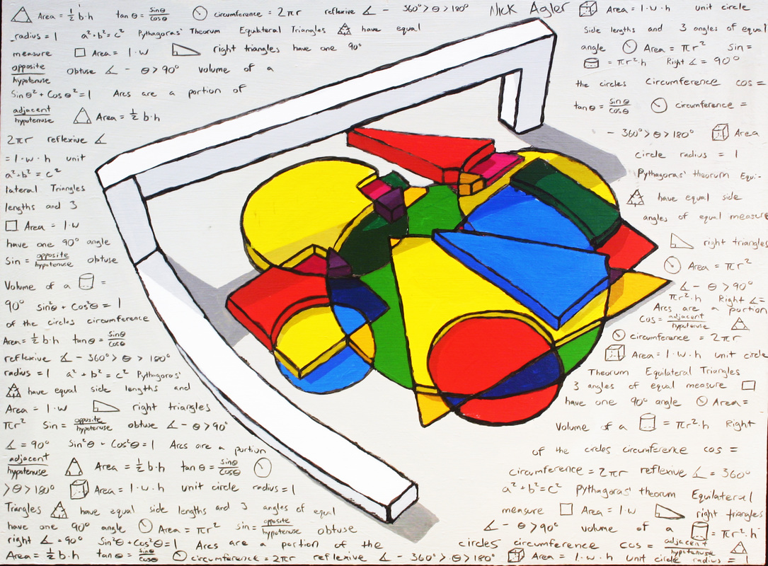
My inspiration for my acrylic piece was Wassily Kandinksy, one of my favorite artists. I really tried to replicate the feeling of abstract objects interlaced within one another, only using more geometric shapes such as circles, triangles and squares. One of the aspects of my piece that came right out of one of Kandinsky's paintings was a lot of empty space, which ended up being used as the area for all the math. Creating my composition in sketchup was difficult, I had to restart about three or four times until I was happy enough with all the colors and how each of the different shapes was elevated at a slightly different level. The math in my painting was very easy to find and it spans from obtuse angles to trigonometric functions. I decided to fill the background with math rather than center because it would've created an imbalance with too much attention in the middle and too much negative space around it. This was the first acrylic painting I've ever done and I really struggled trying to match the colors. The hardest thing about it was definately mixing black paint with some of my colors in order to create the shadow from the overhanging bar in the back. I feel as though I did a good job on this painting and I've learned that patience is extremely valuable in art. |
|
Nick Buendia
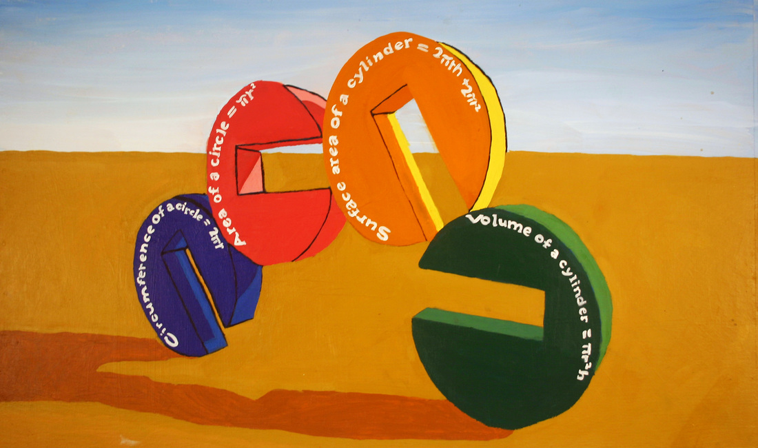
For my acrylic painting I decided to make a stack of some interesting shapes that I could easily apply math to. So I decided to use simple circles with a piece cut out of each one. It added a little more variety to it other than just a simple circle. Once I got the general shape down, I decided to add some color to it. I played around with a lot of colors but eventually decided on some brighter colors. However, once shadows were introduced into the piece, it made some of them much darker than their original color. The math that was used in this piece is just simple equations for a circle and a cylinder. Overall, I’m very content with how it came out, especially the way the text for the math came out. |
|
Albert Covarrubias
For the acrylic painting we had to find an artist and draw our make a replica of the same thing. After many hours of trying to look for an artist, I realized that I was not going to find an artist I liked enough to do a representation of. So I decided to come up with my own picture and I would be my own inspiration. My painting was suppose to represent a bridge. The idea came from when I went to the San Francisco and I saw the Golden Gate bridge for the very first time. It was so amazing to me that I wanted to make something similar to it or something that represented it. I had first thought about the idea of making the bridge look old western but I thought that it would look better if I made it look more of the futuristic look. Now that I had my idea of what it was going to look like, I needed to know what math I was going to put in it. I looked up bridges online and I found out that most bridges have triangles, squares, rectangles and some circles. So I needed a way to incorporate all these shapes into my painting so there would be a reason for me to put math. I really like how my painting turned out. It was very difficult at times and I believe that I could have done a better job finding the colors but overall I think that it came out pretty good. |
|
Romona Cervantes
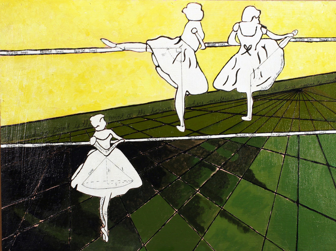
My painting was inspired by Degas, the 18th century painter of brilliancy. At the time I was skeptic on the thought of using one of his pieces to paint my very own, but discovering and understanding the same method I used while painting my watercolor I was very capable and positive that I could paint an original piece. I learned the ideal process, it helped me to understand how important the processing steps were, and instead of making one sketch I was able to make multiple thus being able to pick which one looked better. When I was in the process of painting I ran into various problems, such as trying to find the right colors and the perfect place to start. I was always wasting time on the same part of the canvas instead of going through the painting and finishing, it had come to the point where I was spending time on one part for three days straight, thus resulting in me finishing late according to my agenda. When looking at what I need to accomplish I gave up trying to make it perfect, which was better chose over all. Altogether I was very pleased with my final piece. |
|
Raquel Morris
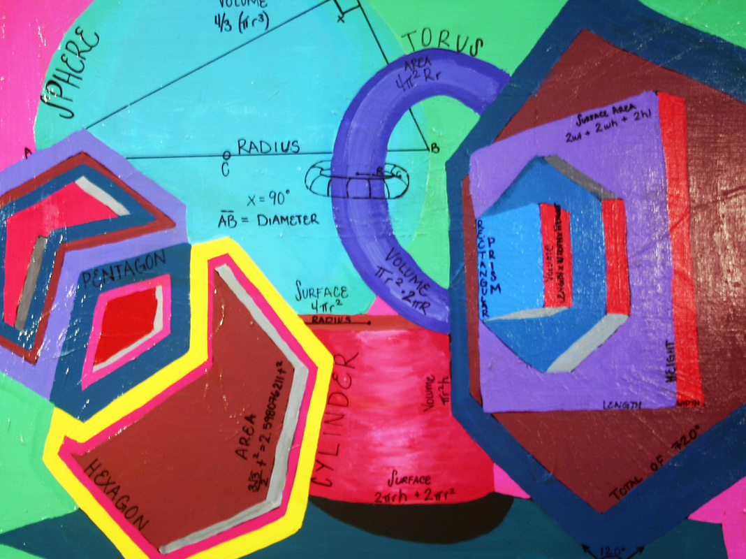
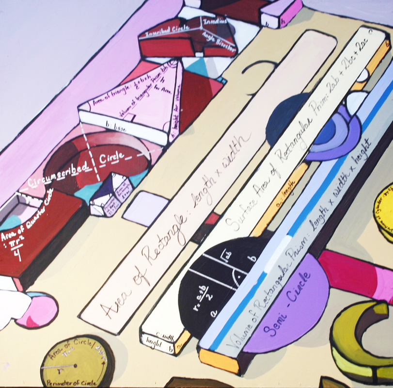
My acrylic painting was inspired by Frank Stella, an Islamic artist. I decided to paint a composition of shapes similar to some of Stella’s paintings. I decided to make a layout of how I wanted to the shapes laid out on Google Sketch-Up, this way I could see what I liked and did not like in advance. Including math in the painting was simple due to the fact that there were so many shapes. I was able to include math with: a hexagon, torus, a rectangular prism, cylinder, sphere, etc. When painting this composition I had difficulty choosing the colors for both the shapes and the background. But through hard work and perseverance, I was able to find a suitable background color that flowed with the rest of the painting. The part of the painting that I particularly like is the cylinder and sphere. Jeff Robin taught me a technique of how to make a shape look as if it has depth. I was able to use this technique on quite a few of the shapes and this helped add a 3D feel to the painting. Overall, I am very pleased with the outcome of my piece. |
|
Rocket Beltran
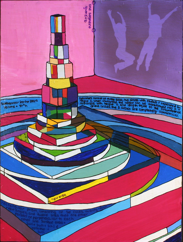
My painting, inspired by Frank Stella, consists of a stack of cubes and cylinders that slowly get smaller in width and taller in height. For the assignment, we were required to create an art piece on Google SketchUp and to paint it. In conjunction with Frank Stellas colorful and shape-driven art pieces, I decided to paint my shape a variation of colors, shades, and opacities. My painting was very simple and to the point, all planned out, and fit the requirements of the project. When a friend jokingly put a plastic silhouette of an elementary school kid jumping onto my painting, I decided that Id mess with the plan, and spray-paint the silhouettes onto my painting. I personally like the way that part of the painting turned out, and am glad that for once, I turned to spontaneity rather than my original plan. Though it seems counterintuitive to connect calculus with art, this project enabled me to understand the exact parameters of what I was painting, which enhanced my ability to please the public eye with my art. |
|
Raya Rios
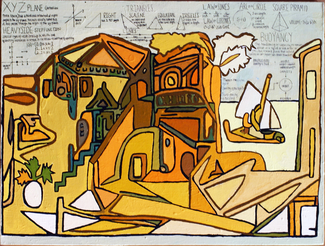
My acrylic painting was inspired by the great Pablo Picasso’s Mediterranean Landscape. What really struck me about this piece were its abstract quality and the variety of shapes that collaborate to create a succinct painting. I wanted to apply those aspects into my own painting, so I first traced the original painting on to tracing paper and scanned it in to Photoshop. After filling the different shapes in with color and playing with the hue and saturation, I stumbled upon a similar design with more profound shapes and a color balance of yellows, oranges and browns. Creating a design proved to be the most difficult part of the painting process because I wanted to make something that was aesthetically pleasing but still incorporated math. I believe that my final design satisfies both. I had never painted with acrylic on canvas so I was initially really excited to start. I learned that making colors were very difficult and I struggled to be patient enough to get the colors perfect. When I made the correct color I enjoyed painting the thick black lines and the different shades despite its tediousness. Once I finished painting I added the math in sharpie to the sky instead of directly on top of the painting to avoid clutter. The math that I incorporated was more applied math and that added a whole new aspect to my piece in comparison to the math of my peers’. I decided to put applied math like buoyancy and step functions which apply to the sail boat and the stairs within my painting. Overall, I enjoyed the painting process and was pleased with my overall piece including the math that was incorporated. I know it is not up to par with Picasso, but for my first acrylic I was pretty proud of what I accomplished. |
|
Sam Lewis
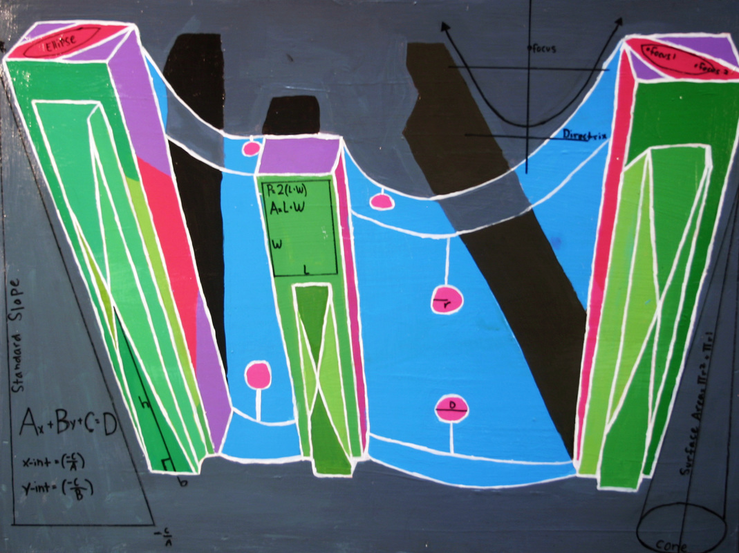
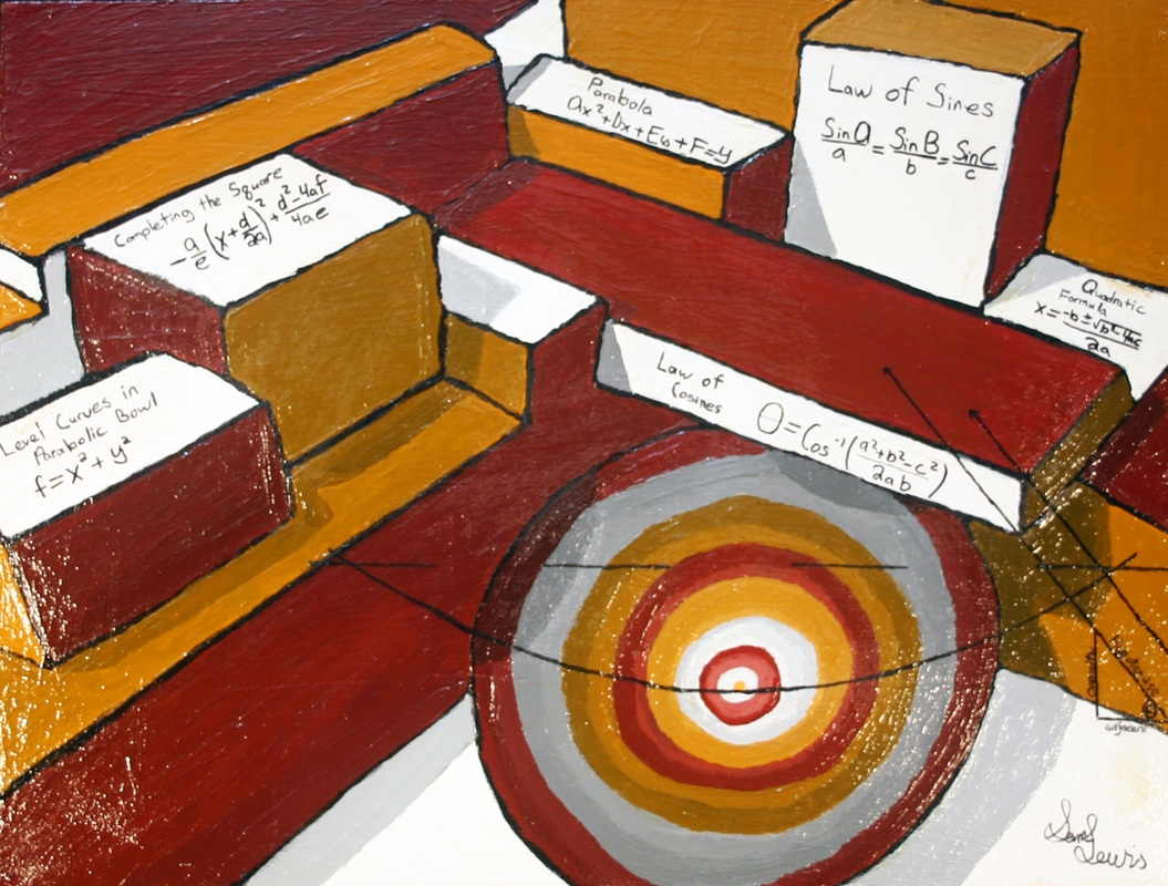
A unique feature of this painting is the many block shapes all stacked around a parabolic bowl tilted so one can still see the depth to the bowl. Before I came up with this final painting I designed many rough drafts trying to decide which one I wanted to do. Finally after much designing in Sketch Up I decided I wanted to make a painting using only a couple of colors that would be interesting to look at. The most difficult part of the painting for me was making the parabolic bowl. At first when I painted this part it would look like a circle so I would have to redo it and try to make it look like it had depth. It was after a little while I managed to finally made it how I wanted it. My favorite of my painting would be the math I added into the painting. I tried very hard to have unique and interesting math on my art and I feel that I accomplished that by adding quadratics to the piece. |
|
J.P. Montello
My acrylic painting depicts geometric shapes in a composition similar to the famous artist Wassily Kandinsky. His painting Black and Violet uses geometric shapes and complimentary colors to create abstract art. Seeing the math potential in his artwork, I decided to recreate the art piece with my interpretation. On a CAD program, I created the shapes that I saw in Black and Violet, but in 3-d. With an isometric view of the cad file, I took a screen shot to put into Photoshop. On Photoshop, I manipulated the hue and saturation of the image so that the colors would compliment each other similar to Kandinsky’s art work. The result was, in my opinion, the perfect composition of math and art that fit the scope of the project. To paint my painting, I assembled a canvas on a wood frame. I applied a base coat primer then I traced my image onto my canvas utilizing a projector showing my digital art. I painted 5 layers of paint on to my canvas to achieve an opaque look. It was important to me that the colors be accurate to my digital draft with no white spots on my canvas. When I felt as though the painting needed no more work I stopped painting. I took advantage of the math that I had been learning in Andrew Gloag’s class and applied it to the painting. I added some calculus, some trigonometry and simple math. A sealant was applied and the painting was hung on display. I would like to apply more calculus to the painting but many of the shapes would require an advanced understanding of calculus and would be difficult to fit the math into the appropriate shapes. |
|
Wai Mor
Rolph Scarlett’s piece ‘Allegro’ took me by surprise when I was searching inspirational art for my acrylic painting. The rectangles and circles were so geometrically precise that the painting seemed to be alive in its own right, the dark hole in the right corner made it look mobile, afloat in space. Afterwards I saw Ben Nicholson’s ‘Cathedral’, a collective piece of various shapes combined together, the consistent beige with different hues wanted me to try shadows and color combination. I laid out Scarlett’s piece on Sketchup to help with positioning and color coordination and used Nicholson’s shapes to incorporate into my work. After trying out different angles to paint I decided to use the left side of my piece from a diagonal point of view. It turned out to be one of the most satisfying projects I have done over my four years at High Tech High. The mathematical portion I found was not challenging however I found it difficult to apply Calculus into the painting. It turns out my painting was focused entirely on Geometry! So I ended up looking into geometrical shapes and the different equations applied. Looking back, I had never done a painting before and being able to finish my work independently made me realize painting was not an unattainable skill but something I can achieve if I put my mind to it. |
|
Ricky Ahumada
Never in my life have I painted anything, I don’t even remember a time that I colored something. This class was really hard for me to understand the beauty of art. It was hard for me to see that there was more than just adding paint. Throughout this class I have really learned so much, my final painting came out really well. I learned how to add shadows to painting. I created my painting by just trying to make something out of nothing but weird shapes in different places. You can sort of see a cartoon face figure, it’s not exactly what I was planning to make it but there it is. My painting has a lot of circles and cylinders and that’s what I based it on. I also added more math like adding triangles, angles, and adding equations. |
|
Miles Thompson
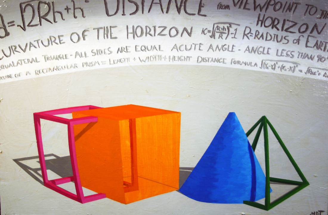
This is my acrylic painting. Much like my watercolor painting, I focused on simple shapes, and a variety of colors. However for this painting I decided to add a warp effect which I think really adds to the painting as a whole. Rather then just sticking to the math relevant to the shapes themselves, I decided to include math about the horizon. I think that this helps draw attention to the warp effect I have created. For my color choice I used blue and green on one side, and I have inverted the colors for the other two shapes. I really like this painting and I feel like it has a great sense of balance. |

